Frontline Teams: 3–5 Team Performance Metrics That Drive Decisions
Christian MontenegroSeptember 20, 202618 min read
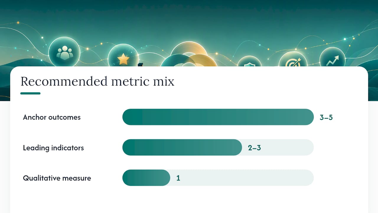
Use a small, balanced scorecard: 3 to 5 business-linked anchor outcomes plus 2 to 3 leading operational indicators, and at least one qualitative team-health measure. Pick the outcomes first, define the formula and owner for each, then set a baseline before judging anyone against it. Everything else in this guide exists to help you build that scorecard without drowning your team in numbers nobody trusts.
TL;DR:
- Tracking only task counts can lead teams to optimize speed at the expense of quality or adaptability, so pairing throughput with error rate or customer satisfaction is essential.
- Metric formulas must have clear, defendable definitions for numerator and denominator, with ownership assigned to specific individuals to avoid disputes and misinterpretation.
- Leaders should focus on a small, balanced set of 3 to 5 anchor outcomes and 2 to 3 leading indicators, reviewing progress weekly, monthly, and quarterly for meaningful insights.
- Use visual dashboards that compare metrics to baselines, annotate anomalies, and highlight trends over time to enable proactive decision-making.
- Rely on verified, system-generated data such as task completion proof and approval records rather than manual logs or self-reporting to ensure trustworthy performance measurement.
Table of Contents
- Why Team Performance Metrics Matter More Than the Numbers Themselves
- Core Team Performance Metrics Worth Tracking
- Metric Formulas, Ownership Rules, and the Denominator Trap
- How to Choose Metrics and Run a Measurement Cycle
- Building a Team Performance Dashboard People Actually Use
- What Frontline Operations Teaches You About Trustworthy Metrics
- A Manager's First 30 Days With Metrics
- How Bossy Turns This Scorecard Into a Daily Habit
- Sources
- FAQ
Why Team Performance Metrics Matter More Than the Numbers Themselves
Metrics only earn their keep when they change a decision. If a number sits on a dashboard and nobody adjusts staffing, coaching, or a process because of it, you're not measuring performance. You're just collecting data for its own sake.
Good measurement forces you to separate three kinds of performance that get blended together far too often. Task performance is the visible stuff: orders filled, shifts covered, checklists closed. Contextual performance is the glue work, like a cook covering a slammed line or a technician training a new hire without being asked. Adaptive performance shows up when conditions change: a supply shortage, a new POS system, a sudden rush. A scorecard built only around task counts misses the second and third categories entirely, and those two often predict retention and quality better than raw output does.
There's a well-documented trap here, sometimes called the "tyranny of metrics": teams start optimizing the number instead of the outcome the number was supposed to represent. Reward call-center agents purely on call volume, and average handle time drops while customer complaints climb. The fix isn't fewer numbers. It's better-chosen ones, evaluated in context rather than in isolation.
This is why the CIPD's evidence review on high-performing teams is blunt about this: there is no single instrument that captures team effectiveness on its own. You need outcome measures paired with team-process measures, read together.
A workable mindset before you pick a single metric:
- Every metric should map to a decision you'd actually make differently.
- Quantitative counts tell you what happened; qualitative signals tell you why.
- A number without a denominator rule is a rumor, not a metric.
- If a metric can be gamed by slowing down elsewhere, it needs a partner metric to catch that.
Core Team Performance Metrics Worth Tracking
Most operations teams don't need more metrics. They need the right handful, organized by what each one is actually for. Split your scorecard into three buckets: anchor outcomes that tie to the business, leading indicators that warn you early, and team-process measures that catch what the spreadsheet can't see.
Anchor outcomes (the lagging numbers leadership cares about)
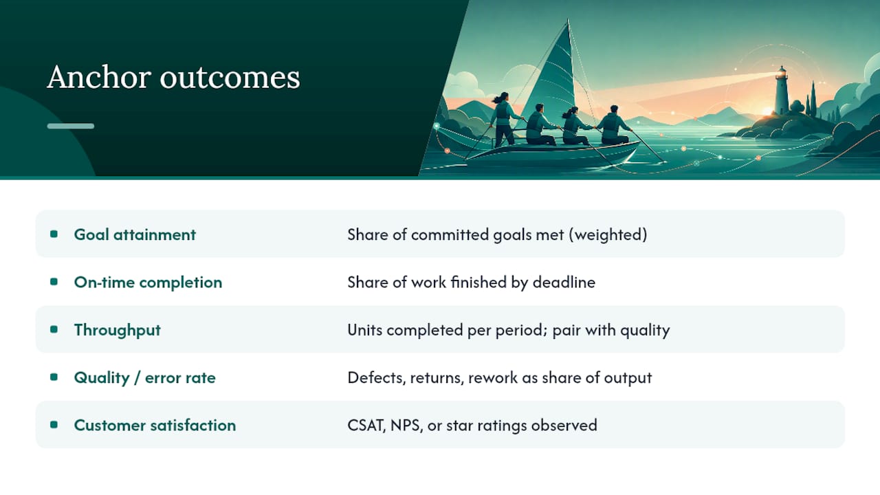
Goal attainment. This measures how much of what you committed to actually got delivered, usually weighted by importance rather than treated as a flat headcount of goals hit or missed. It's the cleanest way to connect a team performance dashboard to strategy, because it forces you to define what "done" means for each goal before the period starts, not after.
On-time completion rate. How often work finishes by its deadline. This is one of the most useful team performance metrics for frontline operations because lateness compounds. A kitchen ticket that's 10 minutes late affects the next four tickets behind it.
Throughput. Units of work completed per period, whether that's tickets closed, orders fulfilled, or rooms cleaned. Throughput alone is dangerous. It rewards speed and says nothing about whether the work was any good, which is exactly why it needs a partner metric.
Quality or error rate. Defects, returns, rework, or complaints as a share of total output. Pair this with throughput every single time. A team hitting record throughput with a rising error rate isn't improving. It's borrowing against next month.
Customer satisfaction. Whether that's a CSAT score, a Net Promoter Score, or a simpler star rating, this metric catches problems that internal counts miss entirely, especially in service environments where the customer sees things the manager doesn't.
Labor efficiency. Useful output divided by labor hours, cost, or headcount. This is the metric owners and finance care about most, and it's the one most likely to get distorted if you're not careful about what counts as "labor hours."
Leading indicators (the numbers that warn you before the outcome slips)
- Cycle time: how long a task takes from start to finish, useful for catching slowdowns before they show up in the monthly report.
- Backlog age: how long items sit unaddressed, a strong early warning for burnout or under-staffing.
- Recurring-task completion: the percentage of scheduled checklists, inspections, or routine work actually completed on time.
- Schedule adherence: how closely actual staffing matches planned staffing, which flags coverage gaps before customers notice.
- Process compliance: how consistently a team follows the defined steps for a safety check, a closing procedure, or a quality control point.
- Verified task completion: the share of assigned tasks confirmed done, not just marked done, through photo proof or manager sign-off rather than a self-reported checkbox.
Team-process measures (the qualitative layer that keeps the numbers honest)
Numbers describe what happened. They rarely explain why a team is fraying at the edges. That's where a lightweight psychological safety pulse earns its place on the scorecard. Harvard Business Review's Laura Delizonna identifies psychological safety as a defining trait of high-performing teams, and it should be measured directly with a short, recurring pulse survey rather than inferred from output numbers, which tell you nothing about whether people feel safe raising a problem before it becomes a crisis.
Round this out with a periodic 360 snapshot (quick peer input on collaboration, not a full annual review), a collaboration index (how often work crosses team lines without friction), and a communication quality check (are handoffs clear, are meetings producing decisions, or just updates).
Statistic to keep in mind: structured team reflection, sometimes called reflexivity, has shown a medium positive effect on team performance across 24 studies covering 4,339 participants. The dashboard doesn't create that improvement. The conversation it triggers does.
The common thread across every metric here: none of them work alone. Throughput needs quality. Goal attainment needs a psychological safety check to make sure people aren't sandbagging targets out of fear. Pick your anchors, but never pick just one.
Metric Formulas, Ownership Rules, and the Denominator Trap
The single biggest source of dashboard arguments isn't the metric. It's the definition underneath it. Two managers can report "90% on-time completion" and mean completely different things if one counts weekends in the denominator and the other doesn't.
Start with formulas you can actually defend in a room full of skeptical managers. The CIPD's performance factsheet lays out a workable baseline set:
- Goal attainment = weighted goals achieved ÷ weighted goals set
- On-time rate = items completed by deadline ÷ items due
- Error rate = defective items ÷ total items produced
- Productivity per labor hour = useful output ÷ labor hours worked
Each formula looks simple until you ask what belongs in the denominator. Is "items due" every ticket assigned, or only the ones that were technically achievable given staffing that day? Is "labor hours" scheduled hours, available hours, or hours actually clocked? The CIPD's own guidance flags this directly: definitional rigor around denominators matters more than most managers expect, because a shift in what counts as "due" or "worked" can flip a trend line without anything on the floor actually changing.
Here's a table you can copy into your own operations metrics dashboard as a starting definition sheet:
| Metric | Numerator | Denominator | Period | Owner |
|---|---|---|---|---|
| On-time rate | Tasks completed by deadline | Tasks due in period | Weekly | Shift lead |
| Error rate | Defective or reworked units | Total units produced | Weekly | Quality lead |
| Goal attainment | Weighted goals achieved | Weighted goals set | Quarterly | Team manager |
| Labor efficiency | Useful output | Paid labor hours | Monthly | Operations manager |
| Verified task completion | Tasks confirmed with proof | Tasks assigned | Daily | Shift lead |
Assign a single owner to each row. Not a department, not "the team." A named person who's accountable for the number being right and for flagging when the definition needs revisiting. The CIPD's factsheet makes the same point: ambiguous ownership creates more disputes over a metric's validity than the choice of tool ever does.
Here's how a denominator swap distorts a trend without anyone touching the underlying work. Say your on-time rate is 85% when "items due" includes every ticket assigned, including ones blocked by a vendor delay outside your team's control. Strip those blocked tickets out of the denominator, and the same underlying performance now reads as 94%. Neither number is wrong. They're answering different questions, which is exactly why the rule has to be written down before anyone compares two periods.
One more habit that saves you from a bad decision: never trust a single team average. Segment by shift, task type, tenure, and manager before you conclude anything. A CIPD evidence review notes that averages routinely conceal single-point failures. A team-wide 90% on-time rate can hide a night shift running at 60% because the day shift is padding the average.
How to Choose Metrics and Run a Measurement Cycle
Picking metrics isn't a one-time exercise. It's a cycle, and skipping steps is how scorecards turn into wallpaper nobody reads past month two.
- Clarify the purpose. What business outcome are you actually trying to move? Retention, speed, quality, cost? Name it before you name a single metric.
- Cascade the goal. Break that outcome into what the team controls day to day. A company goal of "reduce customer churn" becomes a team goal of "reduce order errors" and "improve response time."
- Select a balanced set. Pick 3 to 5 anchor outcomes and 2 to 3 leading indicators, plus one qualitative team-health measure. Resist the urge to track everything you can technically measure.
- Define formulas and owners. Write down the numerator, denominator, period, and named owner for each metric, exactly as outlined above.
- Set a baseline. Measure for one full cycle before setting a target. You can't know if 85% is good without knowing what "normal" looked like last quarter.
- Review on a cadence. Check operational numbers weekly, trends monthly, and strategic fit quarterly.
- Diagnose before you judge. When a number moves, ask what changed in the process, not who to blame.
- Run an experiment. Test one specific change, measure it against the baseline, and only then decide whether to lock it into standard practice.
- Revisit the scorecard. Metrics that stop driving decisions get retired. New priorities earn new metrics.
Cadence matters as much as the metric list. Weekly checks belong to operational numbers like backlog age and schedule adherence, things that need a fast reaction. Monthly reviews are for trend lines: is throughput drifting, is error rate creeping up. Quarterly reviews are where you ask the bigger question: is this scorecard still connected to the business outcome you started with, or has the business moved on without the metrics catching up.
The diagnosis step is where most managers rush. A dip in on-time rate could mean understaffing, a supplier delay, a training gap, or a genuine performance problem, and each of those calls for a different response. Run a small experiment when the cause is unclear or the fix is untested. Go straight to corrective action only when the cause is already obvious and repeatable, like a piece of equipment that keeps failing on the same shift.
Pro Tip: Treat every scorecard review as a question, not a scorecard. Ask "what does this number tell us to try next," and you'll get a very different meeting than one built around "who missed target."
Structured reflection on what happened and why has a documented medium positive effect on team performance, which is the whole argument for building diagnosis into the cycle rather than treating the dashboard as the final word. A practical guide to performance review processes makes a similar case: the review itself needs structure, not just good intentions, or it collapses into a status update nobody learns from.
Building a Team Performance Dashboard People Actually Use
A dashboard's job is to trigger a conversation, not deliver a verdict. The CIPD's own guidance on performance measurement frames metrics as prompts for dialogue, and a good team performance dashboard design follows that logic instead of trying to compress everything into one intimidating screen.
Structure the top layer around your anchor outcomes, with each one paired next to its quality guardrail so nobody reads throughput without also seeing the error rate sitting right beside it. Below that, a second layer holds your leading indicators, the numbers that let a manager catch a problem days before it shows up in the monthly report. A third layer should let anyone drill into a specific shift, task type, or location the moment a number looks off.
A few formatting habits separate a useful employee performance dashboard from a wall of noise:
- Always show a metric against its own baseline, not just a raw current value.
- Compare like periods: this Tuesday against last Tuesday, not this Tuesday against last Friday.
- Annotate anomalies directly on the chart. A holiday, a system outage, or a staffing gap should be visible, not buried in a footnote.
- Favor direction over a single snapshot score. "Trending down for three weeks" is more useful than "72% today."
For visualization, paired line charts work best for the outcome-plus-guardrail combinations, throughput next to error rate, on-time rate next to customer satisfaction, so a manager sees both lines move together or apart at a glance. Small multiples, meaning the same chart repeated once per shift or location, expose which segment is dragging the average down. Heatmaps earn their place when you're hunting for a bottleneck across many steps in a process, like a kitchen line or a warehouse pick path, where color intensity flags the slow stage faster than a table of numbers ever could.
| When to escalate | When to run a team experiment |
|---|---|
| A single metric breaches a hard safety or compliance threshold | A metric drifts gradually with no obvious single cause |
| The same root cause repeats across multiple reviews unresolved | The team has a plausible fix but no data on whether it works |
| Customer or quality impact is immediate and measurable | The issue is isolated to one shift, process step, or segment |
Escalate fast when safety, compliance, or a customer-facing failure is on the line. Reach for an experiment when the fix is untested and the stakes allow for a two-week trial before locking anything in.
What Frontline Operations Teaches You About Trustworthy Metrics
Metrics are only as good as the data feeding them, and frontline teams generate a lot of data that never makes it into a spreadsheet honestly. A checklist marked "complete" by an exhausted closer at midnight isn't the same evidence as a checklist confirmed with a manager's sign-off. This is the gap that pushes many operators toward platforms built specifically around task verification rather than self-reported logs.
Bossy's approach starts by cascading company goals down into the specific daily tasks that actually move them, so a line cook's closing checklist ties directly to a stated goal like reducing waste, not to a generic to-do list floating disconnected from anything leadership cares about. That link matters because it clarifies ownership: everyone on the floor can see which task supports which outcome, instead of guessing why a task exists at all.
The CIPD's implementation guidance on effective performance management points out that for frontline operations, the most reliable evidence often comes from workflow artifacts like completion checks, approval queues, and handoff records, not from surveys or memory. Bossy builds toward exactly that kind of evidence, pairing photo proof with a manager approval queue so a completed task means verified, not merely claimed.
Lean on platform-verified data over manual logs whenever a metric feeds a real decision, staffing, coaching, or a bonus tied to output, because a number nobody can audit isn't a metric. It's a guess with better formatting.
A Manager's First 30 Days With Metrics
Getting a scorecard running fast beats getting it perfect. In week one, name the business outcome you're actually trying to move and pick your top two or three priorities. By week two, lock in 3 anchor metrics and 2 leading indicators, assign a named owner to each, and start collecting a baseline before judging anything. Your first review, around week four, should focus entirely on diagnosis: what the numbers suggest, not who to blame for them. Save target setting for the second cycle, once you trust the data.
— Christian
How Bossy Turns This Scorecard Into a Daily Habit
Everything in this guide depends on trustworthy data, and that's the exact gap most teams hit once they try to build it manually. Spreadsheets go stale, checklists get marked complete without proof, and goals live in a slide deck nobody reopens after the kickoff meeting. This platform is designed for businesses with frontline teams that need daily tasks tied directly to leadership goals.
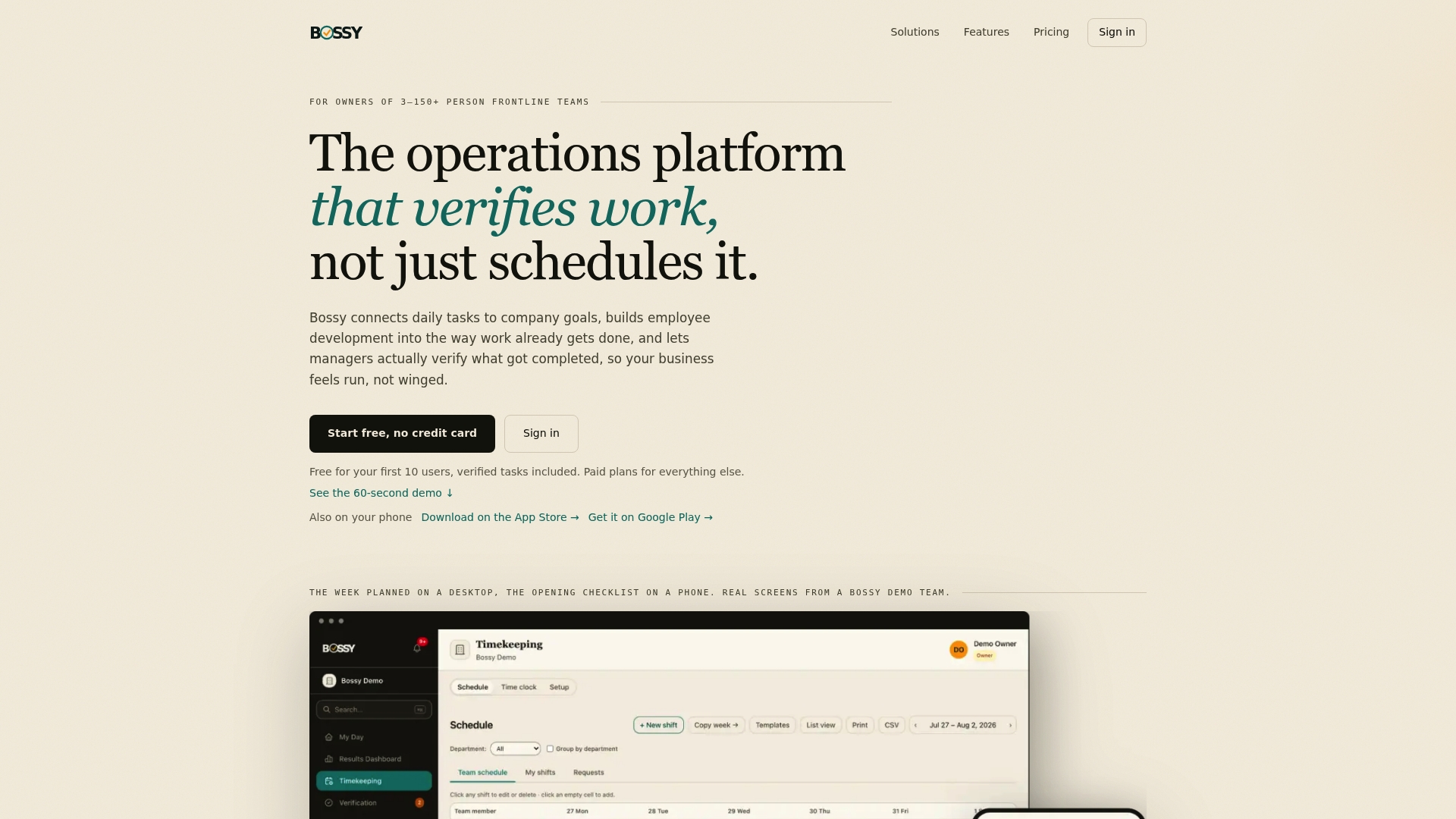
The platform includes features such as task verification through photo proof and manager approvals to improve accuracy of completion data. By aligning tasks with cascading goals and providing analytics dashboards, the system makes trend analysis accessible without manual spreadsheet work. It also includes features such as scheduling, inventory tracking, and employee development tools to support qualitative measures on scorecards.
If you're ready to see what a working scorecard looks like inside your own operation, check Bossy's pricing plans, including a free tier for smaller teams and paid plans like Operations at $30 per month for teams ready to add verification and analytics.
Sources
- High-performing teams: An evidence review (Practice summary) — CIPD
- Performance factsheet — CIPD
- High-performing teams need psychological safety—here’s how to create it — HBR (Laura Delizonna)
- Reflexivity and team performance — APA
FAQ
How do you measure a team's performance?
Combine outcome measures, like goal attainment and on-time completion, with team-process measures, like a psychological safety pulse or peer feedback snapshot. The CIPD's evidence review is clear that no single instrument captures effectiveness alone, so results need to be read in context, not in isolation.
What are the 4 C's of team performance?
Definitions of this framework vary across sources, and this article's research doesn't point to one settled version, so it's better to build your scorecard around the anchor outcomes, leading indicators, and team-process measures covered above rather than force-fit an unverified acronym.
How do you evaluate team performance?
Set a baseline first, then track trends over like-for-like periods rather than judging a single score in isolation. Pair every efficiency metric with a quality or customer guardrail, and schedule structured reviews since reflexive team debriefs show a measurable positive effect on performance.
What are examples of performance metrics?
Common anchor outcomes include goal attainment, on-time completion rate, throughput, error rate, and customer satisfaction. Leading indicators like cycle time, backlog age, and verified task completion, tracked through a system like Bossy's task verification features, catch problems before they show up in the lagging numbers.
How many metrics should a team track at once?
Keep the operating scorecard small: 3 to 5 anchor outcomes and 2 to 3 leading indicators, plus one qualitative measure. The CIPD's guidance on people performance warns that overloaded scorecards tend to get gamed or ignored, so fewer, well-defined metrics consistently outperform a long dashboard nobody reviews.