3–5 Day Frozen Window: Employee Scheduling Metrics Every Manager Needs
Christian MontenegroSeptember 26, 202615 min read

Track these core employee scheduling metrics: schedule adherence, labor cost percentage, forecast accuracy, coverage variance, schedule stability, and absence or no-show rate. Adherence tells you if the plan held up, labor cost percentage tells you if it was affordable, and forecast accuracy tells you whether the whole plan was ever realistic. Coverage variance and schedule stability catch quality problems before they turn into complaints, and absence rate flags the fairness and retention risks hiding underneath. The sections below walk through formulas, benchmarks, dashboard setups, and the quick fixes that move each number.
TL;DR:
- Schedule adherence alone can be misleading if the schedule was poorly planned, as high adherence may still hide coverage gaps or demand mismatches.
- Daily monitoring should focus on real-time adherence and shifts' coverage, while more comprehensive reviews of forecast accuracy and labor cost trends happen monthly.
- Fixes like setting no-edit windows close to shift time, cross-training staff, and managing last-minute absences help improve overall scheduling effectiveness without sacrificing fairness.
- Integrating scheduling with demand forecasting and payroll data prevents system disconnects that can produce inaccurate metrics and hinder actionable insights.
- Industry-specific priorities mean retailers prioritize coverage variance, contact centers focus on adherence interval tightness, and manufacturing values schedule attainment over punctuality.
Table of Contents
- Core scheduling metrics you need to understand
- How to measure each metric: formulas, data sources, and clean-data rules
- From numbers to action: a manager's workflow for improving schedules
- Scheduling dashboard blueprint: the KPIs, views, and visualizations to include
- Common pitfalls and measurement traps
- Integration of scheduling metrics with broader workforce management systems
- Examples of industry-specific scheduling metrics variations
- Frequency and methods for auditing and validating scheduling data accuracy
- Practitioner perspective: balancing schedule quality and adherence
- How Bossy helps managers measure and act on scheduling metrics
- Sources
- FAQ
Core scheduling metrics you need to understand
Every one of these numbers answers a different question about your operation, and mixing them up is how managers end up solving the wrong problem.
Schedule adherence measures how closely actual worked time matches the published schedule. It's usually shown as a percentage, and most operations settle somewhere in the high 80s to low 90s rather than chasing a perfect score, since real life (late buses, sick kids, equipment jams) always eats into it a little.
Labor cost percentage connects your staffing spend to the money coming in. It's the number owners look at first, because it turns "we scheduled 40 hours" into "we spent this much to make this much."
Forecast accuracy is the quiet metric that decides how good every other number can be. If your demand forecast is off, your schedule is built on a bad guess, and adherence, coverage, and labor cost will all reflect that same bad guess no matter how well you manage the day.
Coverage variance and schedule quality look at the plan itself, before anyone even clocks in. Instead of one flat number, the useful view breaks coverage into bands, often shown as P10, P50, and P90, so you can see not just the typical shift but the worst-case and best-case gaps between staffing and demand.
Schedule stability, sometimes called schedule nervousness, tracks how often a published schedule gets edited after it goes live. A high edit rate is a warning sign long before it shows up in adherence or turnover.
Absence and no-show metrics round things out, along with two related signals: advance notice on time-off requests and how often employee preferences actually get honored in the final schedule.
Here's the shortlist to keep visible on any manager's dashboard:
- Schedule adherence: actual hours worked versus scheduled hours, as a percentage
- Labor cost percentage: total labor cost divided by revenue for the same period
- Forecast accuracy: how close predicted demand was to actual demand
- Coverage variance: the gap between staffing levels and demand requirements across a shift
- Schedule stability: the rate of edits made after a schedule is published
- Absence and no-show rate: unplanned absences as a share of scheduled shifts
The habit worth building early is treating these as a set, not a leaderboard. A manager who only watches adherence will eventually get a schedule that looks perfect on paper and still fails on the floor, because adherence never asks whether the plan was any good to begin with.
How to measure each metric: formulas, data sources, and clean-data rules
You cannot fix what you can't calculate, so here's how to build each number correctly.
- Schedule adherence — = (actual minutes worked that match scheduled minutes) divided by (total scheduled minutes) times 100. Say an employee is scheduled for 480 minutes and works 432 of those minutes on time and in shift. Adherence for that shift is 90%.
- Forecast accuracy = 100 minus the absolute percentage error between forecasted and actual demand. If you forecasted 200 customer visits and actually saw 220, the error is 10%, so forecast accuracy is 90%. APQC's forecast accuracy measures describe this calculation as the foundation other scheduling metrics rest on.
To calculate any of these reliably, you need clean raw data: scheduled start and end minutes, actual clock-in and clock-out minutes, break minutes, paid time off, and a demand signal like sales, tickets, or call volume. Treat training time and breaks the same way every pay period, and lock published schedules against silent retroactive edits, since a manager quietly correcting a schedule after the fact will make adherence look better than it actually was.
Pro Tip: Pull your labor cost percentage and adherence from the same reporting period every time. Mixing a weekly labor number with a monthly adherence number will make trends look like they're moving when they're not.
From numbers to action: a manager's workflow for improving schedules
Metrics only earn their keep when they change what you do next. Here's a workflow that turns numbers into fixes without drowning you in dashboards.
- Daily: watch real-time adherence, coverage against requirement, and any active exceptions like a no-show or a late clock-in.
- Weekly: review coverage variance, schedule stability, and absence patterns from the week just published.
- Monthly: step back to labor cost percentage, forecast accuracy trends, and schedule-related turnover.
When something looks wrong, work backward through a simple diagnostic path: start with forecast error (was the demand prediction off), then check schedule infeasibility (was the plan even buildable with the staff you had), then shrinkage (are breaks, training, and paid time off eating more hours than planned), and finally day-of events like a call-out or a rush no one predicted. Most scheduling headaches trace back to one of those four points, and fixing the wrong one wastes a week.
For fixes, a few interventions do most of the heavy lifting. Frozen windows, meaning no schedule edits inside the final 3 to 5 days before a shift, cut down on last-minute chaos and give adherence a fair chance, an approach practitioner sources such as ReliablePlant recommend alongside realistic adherence targets rather than chasing 100%. Cross-training reduces coverage variance because more people can fill more gaps. Shift bidding and a small reserve pool of flexible workers absorb the unpredictable stuff without blowing your overtime budget, and setting an overtime cap keeps labor cost percentage honest.

The trap to avoid is optimizing one metric while quietly wrecking another. A manager who chases perfect adherence by refusing every swap request will tank morale and fairness scores. A manager who chases the lowest possible labor cost percentage by understaffing will watch coverage variance and burnout climb together. Set targets as a balanced set, not a single hero number, and revisit them together every cycle. If call-outs are a recurring source of the gap between plan and reality, handling last-minute absences well protects several of these metrics at once.
Pro Tip: Before adjusting a target, ask which of the four diagnostic points caused last week's miss. Chasing the metric without finding the cause just moves the problem to next week.
Scheduling dashboard blueprint: the KPIs, views, and visualizations to include
A good scheduling dashboard has three layers, and each one serves a different decision.
The day-of operations view is your live feed: real-time adherence, coverage versus requirement for the current shift, and a running list of exceptions like no-shows or late arrivals. This is the view a manager checks on the floor, not at a desk.
The publish-cycle schedule quality scorecard looks at the plan itself before it's even been worked. WFM Labs recommends publishing this scorecard every cycle, covering coverage variance distribution, how well employee preferences were honored, schedule stability, and a fairness measure often expressed as a Gini coefficient across shift distribution.
The monthly trend panel zooms out to labor cost percentage, overtime hours, time-to-fill open shifts, and schedule-related turnover, letting you catch slow drifts that a daily view would never show.
- Use a calendar heatmap to spot which days of the week consistently run short or over.
- Show coverage variance as P10, P50, and P90 bands instead of one flat average, since distributional reporting reveals chronic under-staffing that a single number hides.
- Build an adherence calendar so patterns (always shaky on Mondays, always strong on weekends) jump out visually.
A schedule that looks fine on adherence can still be a bad schedule. WFM Labs notes that schedule quality is best measured as a published artifact, covering coverage, variance, stability, and fairness, not just how closely people clocked in on time.
Common pitfalls and measurement traps
A few mistakes show up again and again, and they're worth naming so you don't fall into them.
- High adherence can hide a bad plan. A schedule with 95% adherence might still have terrible coverage variance, meaning people showed up exactly as planned to a plan that never matched demand.
- Retroactive edits inflate the numbers. If managers quietly adjust the published schedule after the fact to match what happened, adherence looks great and means nothing.
- Chasing labor cost at the expense of fairness. Cutting hours to hit a target percentage without spreading the cuts evenly tanks morale and stability scores together.
- Data gaps quietly break everything. Missing clock-out timestamps and inconsistent break handling (some locations count them, some don't) make every downstream calculation unreliable. Fix this by standardizing time-tracking rules across every location before you trust a single report.
Integration of scheduling metrics with broader workforce management systems
Scheduling metrics rarely live well in isolation. Adherence means little without the time clock data it's compared against, and labor cost percentage means little without a live revenue feed. The most reliable setups pull scheduled hours, actual hours, payroll, and sales or demand data into one system, or at minimum sync them on the same cadence, so a manager isn't reconciling three spreadsheets to answer one question.
This matters most at the handoff points: when a schedule is built, it should draw on the same forecast used for labor budgeting, and when time is tracked, it should feed the same adherence calculation used in the weekly review. Disconnected tools, one for scheduling, one for time tracking, one for payroll, are where most data gaps start, because each system has its own definition of a "shift" or a "break."
Task and goal systems belong in this picture too. A schedule tells you who's supposed to be working, but it doesn't tell you whether the work got done. Pairing scheduling data with task completion and goal tracking gives a fuller picture of whether staffing levels are actually translating into results, not just attendance.

Examples of industry-specific scheduling metrics variations
The core metrics stay the same, but which ones matter most shifts by industry.
Restaurants live and die by labor cost percentage against sales, often tracked hour by hour during peak service, alongside no-show rates that spike around weekends and holidays. Retail cares most about coverage variance tied to foot traffic patterns, since a understaffed Saturday afternoon shows up in lost sales faster than almost anywhere else. Contact centers popularized the term "agent schedule adherence" itself, tracking it in tight intervals, sometimes by the half hour, because a few minutes of drift affects wait times directly. Manufacturing translates adherence into production schedule attainment, measuring whether planned output targets were hit rather than whether an individual clocked in on time. Cleaning and field service businesses often weight schedule stability heavily, since routes and job assignments that shift too often after publishing create real travel and fuel costs, not just scheduling friction.
Knowing which metric carries the most weight in your industry helps you decide where to spend limited management attention first.
Frequency and methods for auditing and validating scheduling data accuracy
Numbers you never check tend to drift quietly wrong. A monthly spot-check comparing a sample of scheduled shifts against actual clock records catches most data entry errors and system syncing issues before they compound. A quarterly deeper audit should trace a handful of shifts start to finish, from forecast to schedule to time clock to payroll, to confirm every system agrees on the same numbers for the same shift.
Watch for the usual suspects: time zone mismatches across locations, break rules that differ by site, and manual overrides that never get logged. Cross-checking against payroll totals is one of the fastest sanity checks available, since payroll rarely tolerates the same small errors that a scheduling report might quietly absorb. When discrepancies turn up, fix the source system, not just the report, or the same error will resurface next cycle.
Practitioner perspective: balancing schedule quality and adherence
Schedule quality is the plan. Adherence is what happened when reality met that plan. Most managers over-index on adherence because it's easy to see, but a well-built schedule with modest adherence beats a poorly-built one with perfect adherence every time. When demand is genuinely unpredictable, weight your effort toward forecasting accuracy first. When demand is steady but staffing keeps slipping, day-of agility matters more. A frozen window of 3 to 5 days and a published scorecard each cycle are the two habits I'd defend as close to non-negotiable.
— Christian
How Bossy helps managers measure and act on scheduling metrics
Most of the pitfalls in this article come from one root problem: your schedule, your time clock, and your task data live in different systems that don't talk to each other. Some operations platforms keep scheduling, geofenced time clocks, task verification, and analytics dashboards in one place, so hours, overtime, and clock-in data come from the same source instead of three exports stitched together in a spreadsheet.
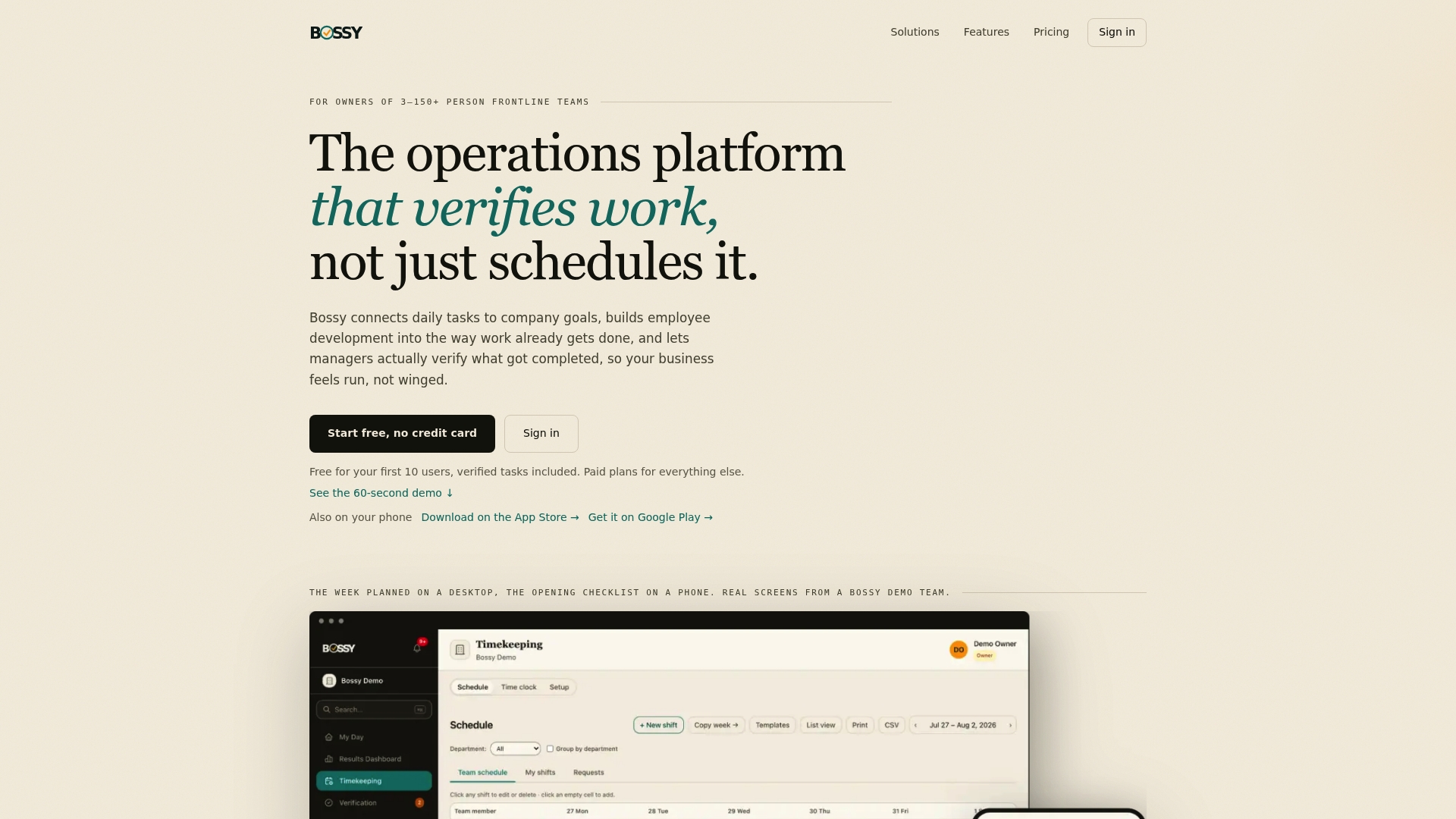
Because some platforms tie daily tasks and photo-proof verification directly to the schedule, you can get a clearer answer to a question adherence alone can't answer: did the work actually get done, not just was someone clocked in.
- Scheduling and geofenced time clocks for location-verified clock-ins and overtime tracking.
- Task verification with photo proof and approval queues so coverage translates into completed work.
- Built-in labor analytics covering hours, overtime, open shifts, fill rate, geofence adherence, and swap and time-off approvals. Metrics like labor cost percentage and forecast accuracy still need your sales data alongside it.
If you're managing a frontline team of 3 to 150 people and tired of reconciling scheduling data across separate tools, check Bossy's pricing plans or look through the full feature set to see how it fits your operation.
Sources
Raw numbers mean little without something to compare them against.
APQC's agent schedule adherence benchmarking measures give organizations a standard way to compare adherence and production schedule attainment against peers, rather than guessing what "good" looks like. BLS absence data offers an external baseline for absence and lost worktime in the U.S. private sector, useful when you want to know if your no-show rate is ordinary or a red flag. CIPD's workforce planning guidance recommends a small set of meaningful metrics over broad, unfocused tracking, paired with regular monitoring and evaluation instead of a one-time audit.
Use these benchmarks as a starting point, then narrow them to your own industry and scale rather than adopting them wholesale.
FAQ
What are the top 3 KPIs for employees?
For scheduling specifically, the three that matter most are schedule adherence, labor cost percentage, and forecast accuracy, since forecast accuracy determines how reliable the other two can ever be. Absence rate and coverage variance are close runners-up depending on your industry.
What are the 5 key HR metrics?
Definitions vary by organization, but a common set includes turnover rate, absence rate, time-to-fill for open positions, labor cost percentage, and schedule adherence. CIPD recommends narrowing to a small set of metrics tied directly to your operational priorities rather than tracking everything available.
What is a 5-2-2-5 work schedule?
A 5-2-2-5 schedule is a rotating shift pattern where employees work 5 days, get 2 days off, work another 2 days, then get 5 days off, cycling continuously. It's used mainly in operations that run continuously, like manufacturing plants or facilities with coverage needs throughout the day and night.
What is a 4-3-3-4 work schedule?
A 4-3-3-4 schedule is a rotating pattern of 4 days on, 3 days off, 3 days on, 4 days off, repeating on a set cycle. Like the 5-2-2-5 pattern, it's built for continuous-coverage operations that need round-the-clock staffing without relying on a standard Monday-through-Friday week.
How often should I review my scheduling metrics?
Real-time metrics like adherence and active exceptions deserve a daily check, while coverage variance and schedule stability are better reviewed weekly at each publish cycle. Labor cost percentage and forecast accuracy trends should get a monthly look, since short-term noise can make them misleading week to week.